Books and readers finding each other.
 Our Services
 Case Study
Bukinistebi
Georgia’s first antiquarian online bookstore.
01Brand Strategy
Imagine Tbilisi’s famous Dry Bridge, with its antique books, rare editions and manuscripts, brought online - making a long-standing bookselling tradition accessible from anywhere in Georgia.
This is the idea behind Bukinistebi, Georgia’s first antiquarian online bookstore. Founded by Paata Shamugia, Georgia’s celebrated poet and writer, Bukinistebi brings the Tbilisi book tradition to customers online. When Paata approached us for full branding strategy development, he wanted a brand that would reflect not only the rich tradition of antique booksellers in Tbilisi, but also Bukinistebi’s innovative approach, including the use of AI to help readers and books find each other.
The challenge was to reconcile tradition and innovation while accommodating both rare collectible material and affordable second-hand books. Focused interviews and research resulted in a central idea behind the brand strategy.
02Central Idea
სადაც წიგნები პოულობენ მკითხველს.Where books find readers.
This idea guided development of the wider brand system.
A modern e-commerce store meets antiquarian tradition.
Sage, with an inherent curiosity for knowledge, without being overly academic.
03Audience
Three distinct ways of looking for the right book.
Through focused interviews, we identified three main customer segments.
Readers who know exactly what they want
These customers know what they are after, and they need to get the right book comfortably. We advised that placing requests for unavailable books would create an environment of care and retain customers even when the book isn’t available at the moment.
04From Strategy to Visual Identity
Historical and literary, without feeling old-fashioned.
We were tasked with creating a visual identity that would encompass both the innovation and traditions of the brand.
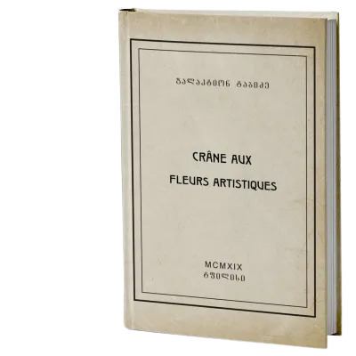
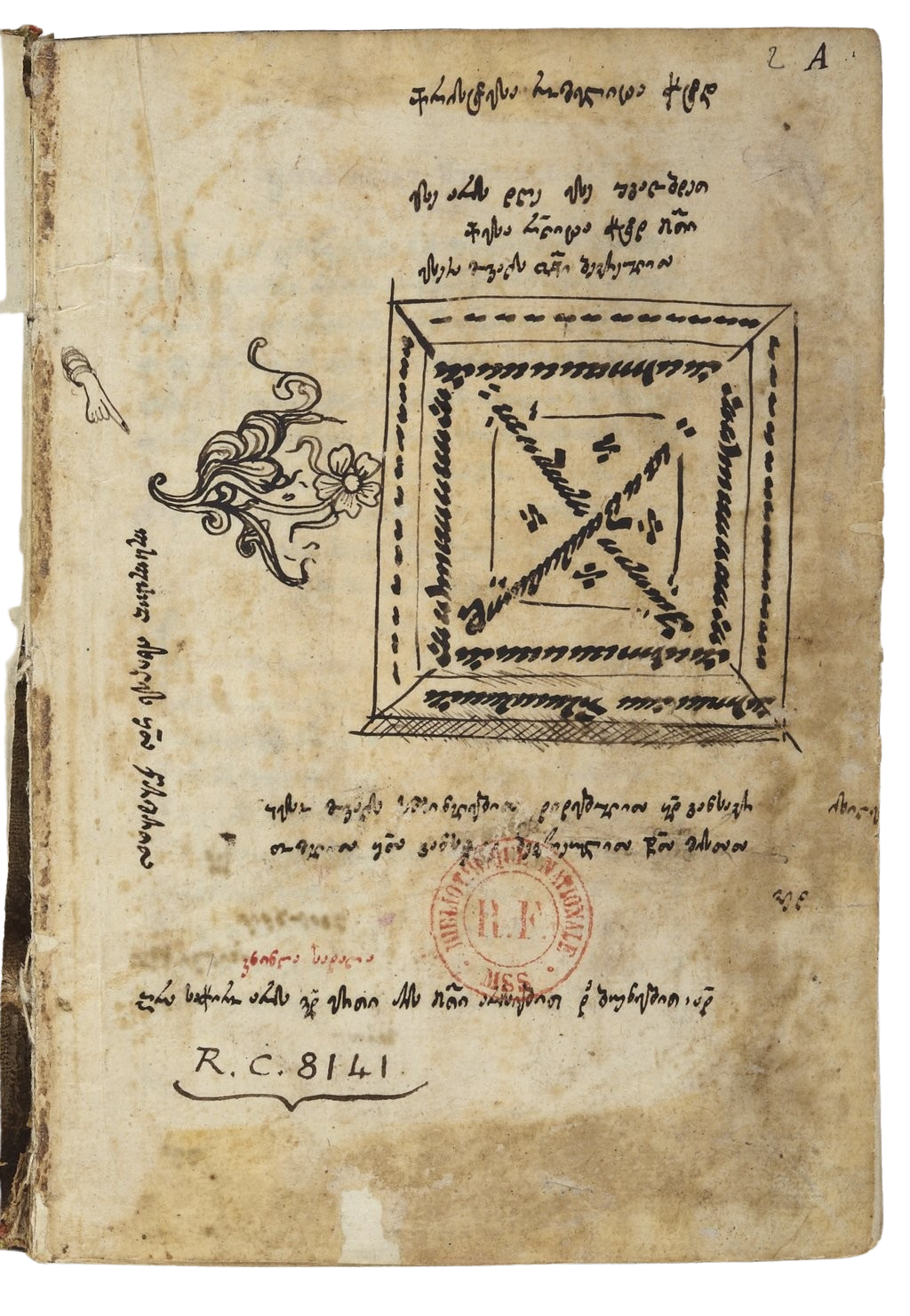
The existing visual system did little to distinguish everyday second-hand books from rare manuscripts and collectible editions. The new system needed to give each category its own visual weight. The typography also needed rethinking, ensuring that clear messages could be delivered in a clear script.
05Colour Palette
Parchment#F0EFEA
A tactile reminder of book pages and a warmer alternative to a white canvas.
Burgundy#7A2E3A
Reserved for rare manuscripts and collectible material, giving them a distinct visual territory and sense of rarity.
Ink Navy#18263A
The principal colour for second-hand and antiquarian books, connecting the digital identity to ink, writing, and books.
Antique Gold#B68A3A
Used sparingly as an accent to reinforce the collection’s archival and heritage character.
Hover or focus on each colour to see its role in the system.
06Typography
Distinctive and memorable, while remaining digitally functional.
The system needed to remain coherent across Georgian and Latin scripts.
ბუკინისტებიBUKINISTEBI
Dachi the Lynx
Contemporary, bold and memorable. Used for display typography and headlines.
სადაც წიგნები პოულობენ მკითხველსWhere books find their readers.
Noto Sans Georgian
Clear, functional and highly legible. Used for body copy, navigation and interface text.
07Verbal Identity
In psychology, the curiosity gap describes the tension created when we become aware of something we do not yet know. That gap can motivate us to seek the missing information. Curiosity therefore became a central principle of Bukinistebi’s verbal identity.
Create Curiosity First.
Sell Second.
This became a core communication principle: instead of telling readers what they already know about a book, Bukinistebi should give them a reason to want to know more.
Accessibility
Literature is not a luxury. Bukinistebi combines collectible material with affordable second-hand books.
Individuality
Every reader has different tastes, just as every second-hand or rare book has its own history.
Tradition
Bukinistebi brings the knowledge and culture of Georgian antiquarian bookselling into a contemporary digital environment.
08Outcome
A strategy designed to work beyond the page.
The final system gave Bukinistebi a defined positioning, audience strategy, verbal identity and visual direction that could be consistently applied across its website, social media, newsletters and future design work.
The work was delivered as a 31-page applied brandbook, designed not simply to define the brand, but to show how the strategy could be translated into practical communication.